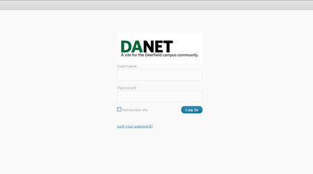
 For several members of the IT and Communications Departments, July marked the laborious final stretch in their summer project. By the month’s close, they had completed a brand new DANet website, made available to the community during the fall term.
Only minutes on the site make clear the extent of the makeover. Because the old site was built on aged coding, it was difficult to simply plug in code for easy fixes. For that reason, Mr. Thiel said, “We had to completely replace the underlying technology.” But for the amount of work involved, the project had surprisingly humble origins.
Work first began in the spring of last school year, when Anna Newman, a new IT employee, joined the Communications department. “Within days, I realized Ms. Newman had a lot more technical skills than I had expected,” Mr. Thiel said.
On a whim, Mr. Thiel decided to start work on a new DAnet with the assistance of the communications department and Ms. Newman’s talent. At first, there were no expectations – there had been no plans for a site makeover. “It was decided that if we got a little into it, and it became too tough, we’d forget about it,” Mr. Thiel explained.
And there was good reason to be hesitant. Much would have to be accomplished in short time, with limited resources.
The old DAnet contained a laundry list of problems requiring attention. It lacked a search function and multi-level navigation, and many of its components, such as the “Organizations” feature, had fallen into disrepair.
They made these repairs and additions in impressive time, completing the site at July’s end. The final product represented a staggering improvement. Unlike its predecessor, edits and additions to the new site take minutes. “We can install any plug-in for any function whatsoever within seconds,” Mr. Thiel said.
Perhaps most notable about the new version, however, is that it is open to contribution directly from the community. “The old site was almost a single feed,” Mr. Thiel explained. But with its makeover, any community member can post an item without having to go through the old multi-step process. The lost and found is created completely by direct community input.
When the site made its debut in October, it was met with mixed reception. “I don’t really like the change,” Grace Mermel ’12 offered, a reflection of the sentiment held by some students across campus.
However, response has grown increasingly positive as students have begun to grasp how much the new website has to offer. Justin Schlacks ’13 voiced his support: “The navigation is easier, and it just looks cleaner.”
“It’s just really easy on the eyes,” said Kelvin Chang ’12 It is early, but as more students discover all the new site has to offer, it is increasingly clear that it will stand the test of time.